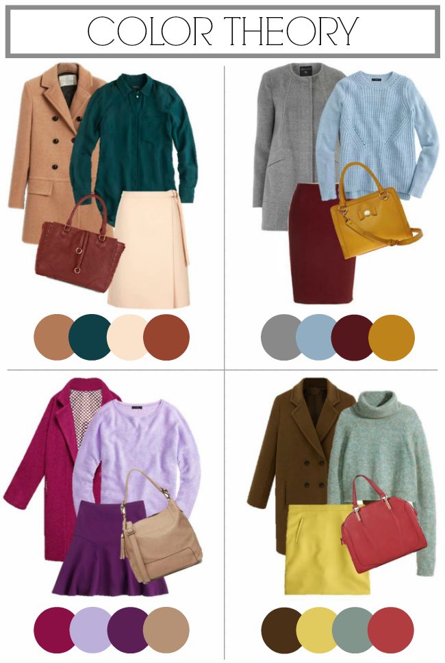
Are you tired of the same old boring color combinations? Do you yearn for a unique and eye-catching aesthetic that sets you apart from the crowd? Look no further! In this article, we will explore the world of colors and delve into the question: Which 2 color combination is best? Get ready to unleash your creativity as we dive into a captivating journey filled with vibrant hues, striking contrasts, and endless possibilities. Whether you’re an artist seeking inspiration or just someone who wants to add a touch of excitement to their everyday life, this article is sure to leave you with some fascinating insights and ideas.
Why color combinations matter in design.
Colors play a crucial role in design, as they have the power to evoke different emotions and create specific moods. The right combination of colors can enhance the visual appeal of any design, whether it’s a website, logo, or print advertisement. Color combinations should be chosen carefully to ensure they accurately represent the brand or message being conveyed.
The choice of color combinations can create harmony or contrast within a design. Harmonious color palettes use colors that are next to each other on the color wheel, creating a soothing and unified feel. On the other hand, contrasting color schemes employ colors that are opposite each other on the color wheel, adding excitement and vibrancy to designs. In addition to setting the mood, color combinations also affect readability and usability. The wrong combination can make text difficult to read or cause images to appear distorted. By selecting complementary colors for text and backgrounds, designers can improve legibility while maintaining an aesthetically pleasing design. Overall, understanding how different colors work together is essential for effective design. A thoughtful selection of color combinations will not only captivate viewers but also effectively communicate desired messages and create memorable experiences.
Section 1: Understanding color psychology.
Understanding color psychology is key when deciding on the best color combination for any project. Colors have the power to evoke emotions, convey messages, and influence behavior. For example, red is often associated with passion and power, while blue can signify tranquility and trustworthiness. By understanding the psychological effects of specific colors, we can strategically choose a color combination that aligns with our desired outcome.
When it comes to choosing a color combination, considering contrast is important. Contrast refers to the difference in brightness or hue between two colors. High contrast combinations like black and white can create a bold and striking effect, while low contrast combinations like pastels can evoke a sense of softness and harmony. By playing with contrast in our chosen colors, we can create visual interest and make a lasting impact on viewers. Another important factor to consider is cultural associations with different colors. Different cultures may have varying interpretations of certain hues. For example, in Western cultures, green often symbolizes nature and freshness while it is associated with financial wealth in some Eastern cultures. It’s crucial to research cultural meanings before finalizing any color combination for global projects to ensure effective communication across diverse audiences.
Section 2: Exploring complementary color combinations.
One highly effective color combination that often goes unnoticed is the use of complementary colors. Complementary colors are opposite to each other on the color wheel, creating a vibrant and visually striking effect when paired together. For example, blue and orange or red and green are classic examples of complementary color combinations. These combinations offer a sense of balance and harmony as they enhance each other’s intensity.
The secret to successfully exploring complementary color combinations lies in understanding the power of contrast. By pairing two colors that lie on opposite ends of the color spectrum, you create a bold statement that grabs attention instantly. This contrast can be utilized in various design elements such as website layouts, interior design schemes, or even fashion choices. The key is to find a balance between the two colors so that they don’t overpower each other but rather complement one another seamlessly. Additionally, exploring complementary color combinations allows for endless possibilities in creativity. You can experiment with different shades and tones within the chosen complimentary pair to create unique effects and moods. It’s fascinating how these contrasting colors can play off one another in ways that evoke different emotions – warm against cool tones, feeling energetic versus calmness – providing an opportunity for designers to communicate complex messages through their choice of hues.
Section 3: Analyzing analogous color combinations.
When it comes to finding the best color combination, analogous colors can offer a harmonious and visually pleasing option. Analogous colors are those that sit next to each other on the color wheel. This means they share a common hue, creating a sense of cohesion in the overall design.
One advantage of using analogous color combinations is their ability to create a soothing and calming effect. Because these colors are neighbors on the color wheel, they naturally complement each other without causing any visual discord. Whether you opt for warm hues like red-orange and orange or cool shades like blue-green and green, analogous color schemes can evoke a sense of harmony and balance. Another benefit of utilizing analogous colors is their versatility in different design settings. They can be used effectively in various creative endeavors such as graphic design layouts, interior decorating, or even fashion styling. By selecting an analogous color scheme that matches your desired mood or message, you can instantly communicate with your audience on an emotional level.
Section 4: Discussing triadic color combinations.
When it comes to color combinations, triadic color schemes offer a dynamic and vibrant look. Triadic colors are three hues that are evenly spaced on the color wheel. This creates a balanced composition that is visually appealing and can be used to create eye-catching designs.
One example of a triadic color combination is using red, yellow, and blue. These primary colors work together harmoniously to create a bold and energetic palette. Another popular triadic combination is orange, green, and violet. This blend brings warmth, freshness, and depth to any design or artwork. One of the advantages of triadic color combinations is their versatility. They can be used in both modern and traditional settings, making them suitable for various design projects like logos, websites, or interior design. The key to using triadic colors effectively is finding the right balance between each hue so that one does not overpower the others. By experimenting with different shades and tones within each color, you can achieve stunning results that capture attention while creating a sense of harmony in your designs.
Conclusion: Deciding the best color combination for you.
In conclusion, deciding the best color combination for you ultimately comes down to personal preference and how you want your space or brand to be perceived. While trends and expert advice can serve as useful guides, it’s important to trust your own instincts and go with what resonates with you.
Rather than getting caught up in the idea of a perfect color combination, think about what emotions or mood you want to evoke. Consider the purpose of the space or the message you want to convey with your brand. Is it calm and serene? Bold and energetic? By understanding the psychological effects of colors, you can make an informed decision that aligns with your intentions. Remember that color is not just limited to paint on walls or logos on websites; it encompasses a wide range of elements including furniture, fabrics, accessories, and lighting. Experimenting with different combinations can be fun and exciting, allowing you to express your creativity. Don’t be afraid to take risks and explore new possibilities – who knows, you might discover a unique color combination that becomes synonymous with your personal style or brand identity.
Ultimately, finding the best color combination is an ongoing process that may evolve over time as trends change or circumstances shift. Embrace this fluidity and enjoy the journey of discovering colors that resonate with you – after all, it’s all about creating spaces that make us feel happy, comfortable, and inspired. So go ahead and trust your instincts when exploring different color combinations – they are often more powerful than any expert advice out there!


Be First to Comment